SimpleOTIS CSS Customization How-To-Guide
Introduction
You may wish to customize the appearance of your SimpleOTIS pages beyond the default styles provided by the theme you have installed. To this end, we have added a number of CSS classes specific to the plugin which you can use to apply your own styles. This requires some knowledge of HTML and CSS, but shouldn't be too onerous if you know a little bit about customizing WordPress themes.
Editing The Theme's CSS File
There are a number of ways to customize the appearance of your site, and many WordPress themes come with their own user interfaces geared specifically toward this goal. All themes, however, can be customized by finding the Theme File Editor in the Tools section of the WordPress admin and modifying the style.css file found there.
This is an easy and reliable way to apply custom styles. However, note that if you customize the theme's style.css file and then change the theme, you'll have to replicate your customizations in the new theme. Therefore, it's important to have a system for saving your work outside of WordPress. How you do this is up to you.
Example: Customizing A Detail Page
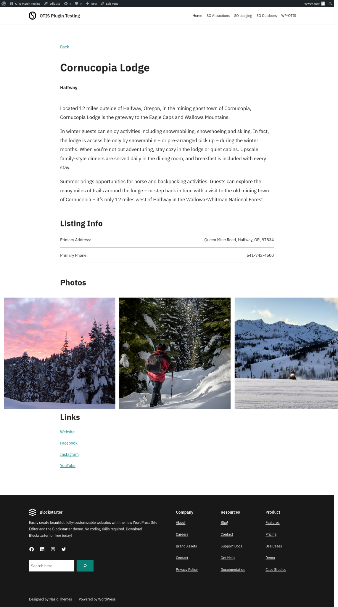
Let's go through an example of customizing a detail page. Here is a listing detail page with no customizations, using the WordPress theme "Blockstarter."

Let's make some changes. We will do the following:
- Increase the width of the content of the page.
- Hide the hero image.
- Increase the font size of the description paragraph.
- Make the name header bold.
- Display photos horizontally, make them take up the width of the whole page, and scroll left to right.
We apply the following styles:
.simpleotis-hero-photo {
    display: none;
}

.simpleotis-listing-container {
    width: 100%;
    max-width: 1200px;
}

.simpleotis-section {
    margin: 3em 0 3em 0;
}

.simpleotis-listing-header {
    font-weight: bold;
}

.simpleotis-description > p {
    font-size: 1.25em;
}

section.simpleotis-gallery-section {
    height: 550px;
    position: relative;
}

.simpleotis-gallery-container {
    display: flex;
    align-content: center;
    width: 100vw;
    left: calc(50% - 50vw + 1em);
    overflow-x: scroll;
    overflow-y: hidden;
    position: absolute;
    height: 500px;
}

.simpleotis-photo-container {
    height: 100%;
    margin-bottom: 0 !important;
}

img.simpleotis-gallery-photo {
    width: auto;
    height: 100%;
    margin-right: 1em;
}

h2.simpleotis-photos-header {
    margin-bottom: 1em;
}
This results in the following changes to the page. Notice how the listing takes up much more available space on the page, so it doesn't scroll as far down. We have also increased the top and bottom margins on each section to be proportional to the increased size and width.

Note that these CSS changes are meant only as an example of what is possible. Users should make sure that any custom styles look good at all screen sizes, and that they make sense given the chosen theme of the site, etc.
We provide a complete reference of all CSS classes and all HTML generated by the shortcodes in the reference guide.